Most Beautiful Interior Paint Colors for Offices and Commercial Spaces in Dubai
The most beautiful interior paint colors do more than look good. They set the mood for your team, signal the quality of your brand, and change how large a…
The most beautiful interior paint colors do more than look good. They set the mood for your team, signal the quality of your brand, and change how large a room feels. In Dubai, strong sunlight and glass facades add a twist: the shade you pick on a chip often looks different on the wall.
In this blog, what you will find :
- A quick table of 10 beautiful colors and where each one works
- The best colors for offices, reception areas, meeting rooms, retail stores, restaurants, showrooms, and schools
- How Dubai's light changes paint colors
- Five ready palettes with a simple 60-30-10 split
- Paint color mistakes to avoid, with a one-line fix for each
- A finish guide: matt, eggshell, or satin
- FAQs
The Most Beautiful Interior Paint Colors at a Glance
Looking for the most beautiful wall paint color for a commercial space? Start with this table. Each shade earns its place through the mood it creates and the room it suits, not through trend.
|
Color |
Mood it creates |
Best suited for |
|---|---|---|
|
Warm white |
Clean, open, welcoming |
Reception areas, open-plan offices, corridors |
|
Light grey |
Calm, professional, focused |
Executive offices, finance and legal firms |
|
Greige (grey-beige) |
Refined, balanced, warm |
Corporate offices, showrooms, meeting rooms |
|
Soft blue |
Trust, calm, concentration |
Meeting rooms, consulting offices, clinics |
|
Sage green |
Fresh, restful, natural |
Creative studios, wellness areas, schools |
|
Terracotta |
Warm, grounded, inviting |
Accent walls, cafés, restaurants, lounges |
|
Sand and stone beige |
Soft, luxurious, timeless |
Retail stores, hospitality lobbies, showrooms |
|
Deep navy |
Authority, depth, confidence |
Boardrooms, feature walls |
|
Olive green |
Earthy, steady, premium |
Real estate offices, cafés, libraries |
|
Blush |
Gentle, friendly, creative |
Boutiques, learning spaces, washrooms |
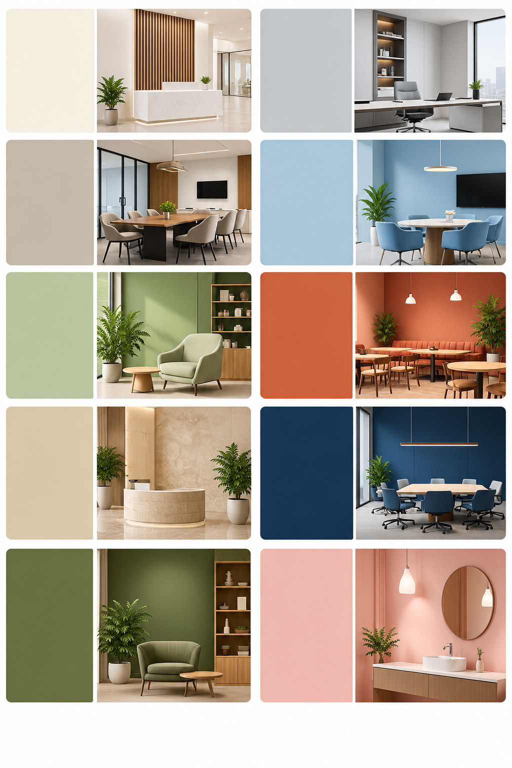
Best Interior Paint Colors for Each Type of Commercial Space
What are the best interior colors for a commercial space? The answer changes with the room. Here is how we match color to purpose.
Offices
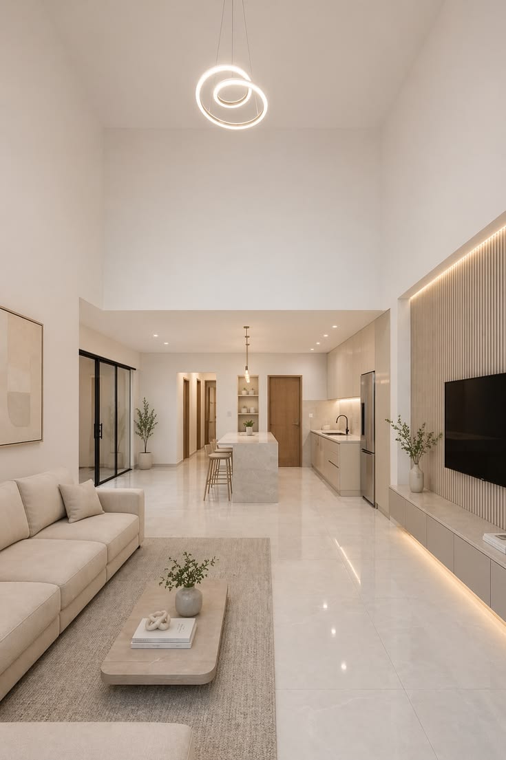
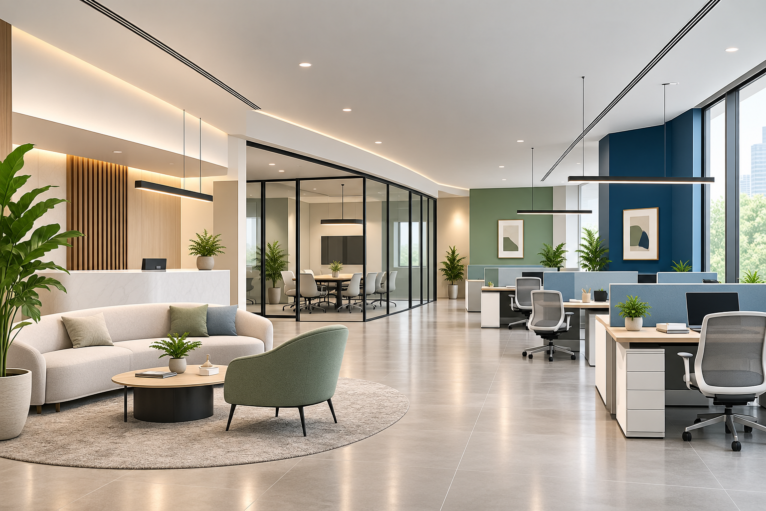
Interior paint color for office walls has to stay comfortable for eight hours a day. Warm white, light grey, and greige make a calm base.
Add soft blue or sage green in areas where focus matters, and keep bolder shades for one feature wall.
Reception Areas
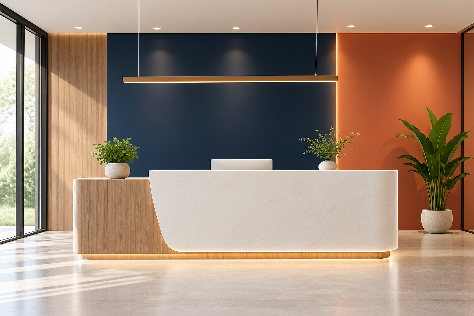
Reception is the first impression of your brand. Warm white or greige sets a welcoming tone.
A feature wall behind the desk in deep navy, terracotta, or your brand color gives visitors something to remember.
Meeting Rooms
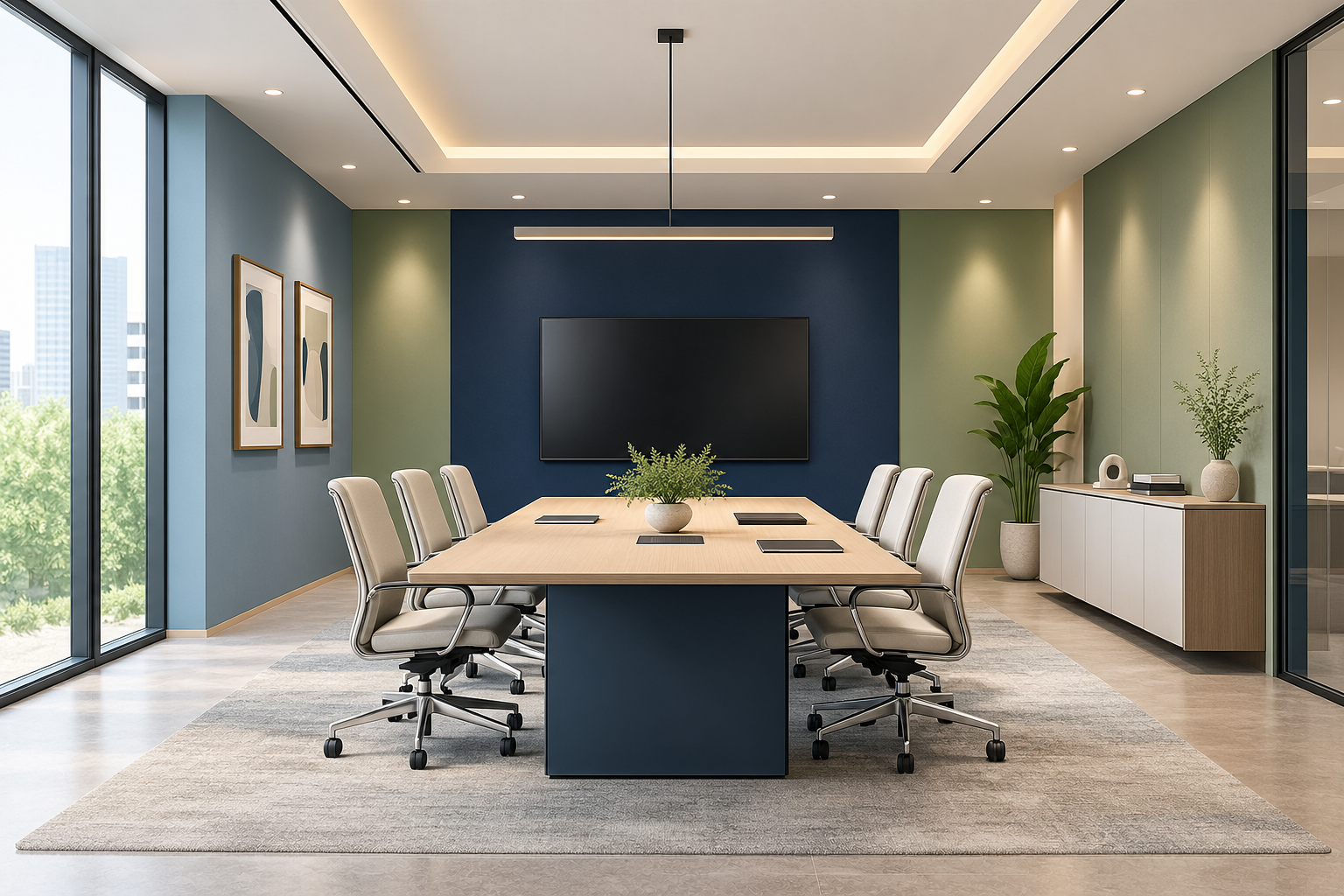
Soft blue and muted green support calm, focused conversation. A deep navy accent adds weight to boardrooms.
Avoid strong red across all four walls, since it can feel intense in long meetings.
Retail Stores
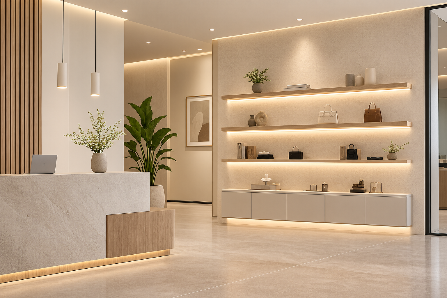
Let the products lead. Warm white, stone, and soft beige make a neutral backdrop that keeps attention on the shelves.
Save bold colors for display walls, fitting rooms, and brand moments.
Restaurants and Cafes
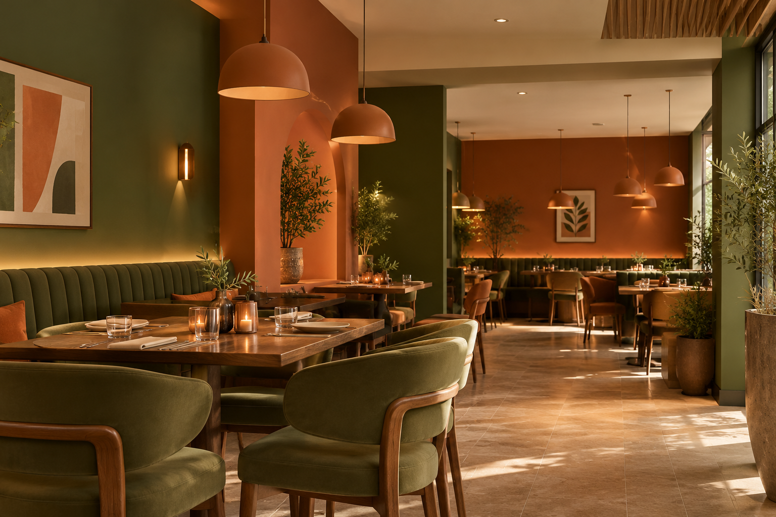
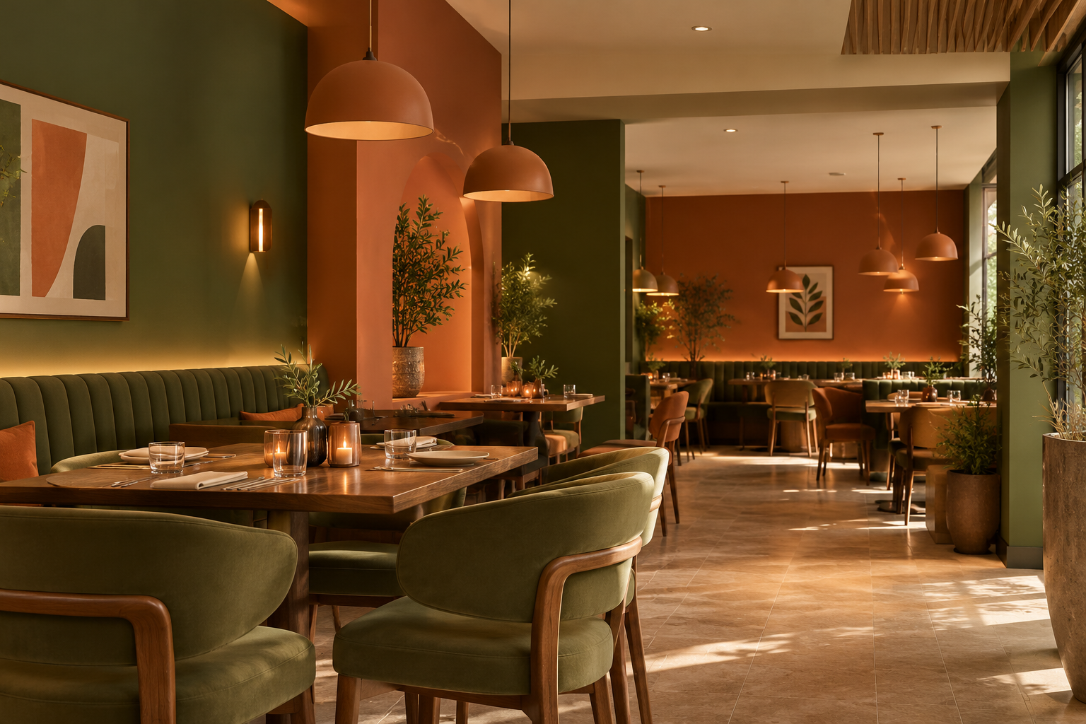
Warm tones such as terracotta, olive, deep green, and cream make food and people look good.
Evening lighting is lower, so test your shortlisted shades at night as well as during the day.
Showrooms
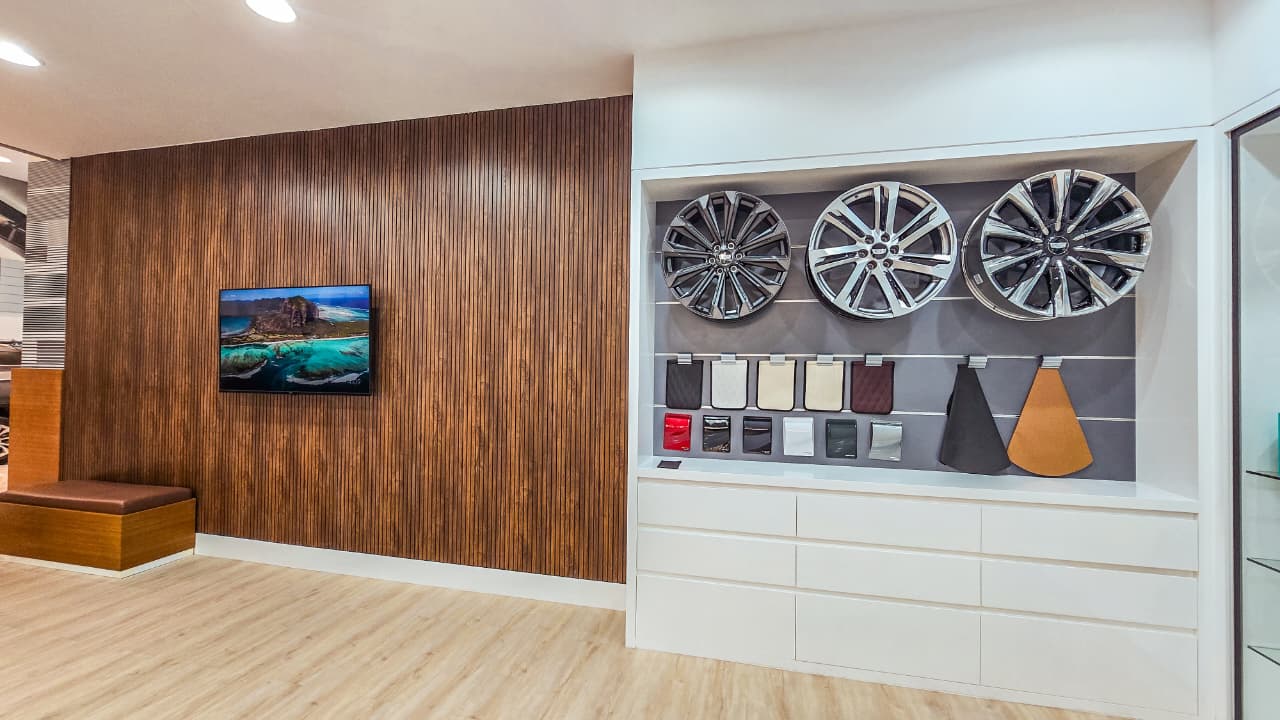
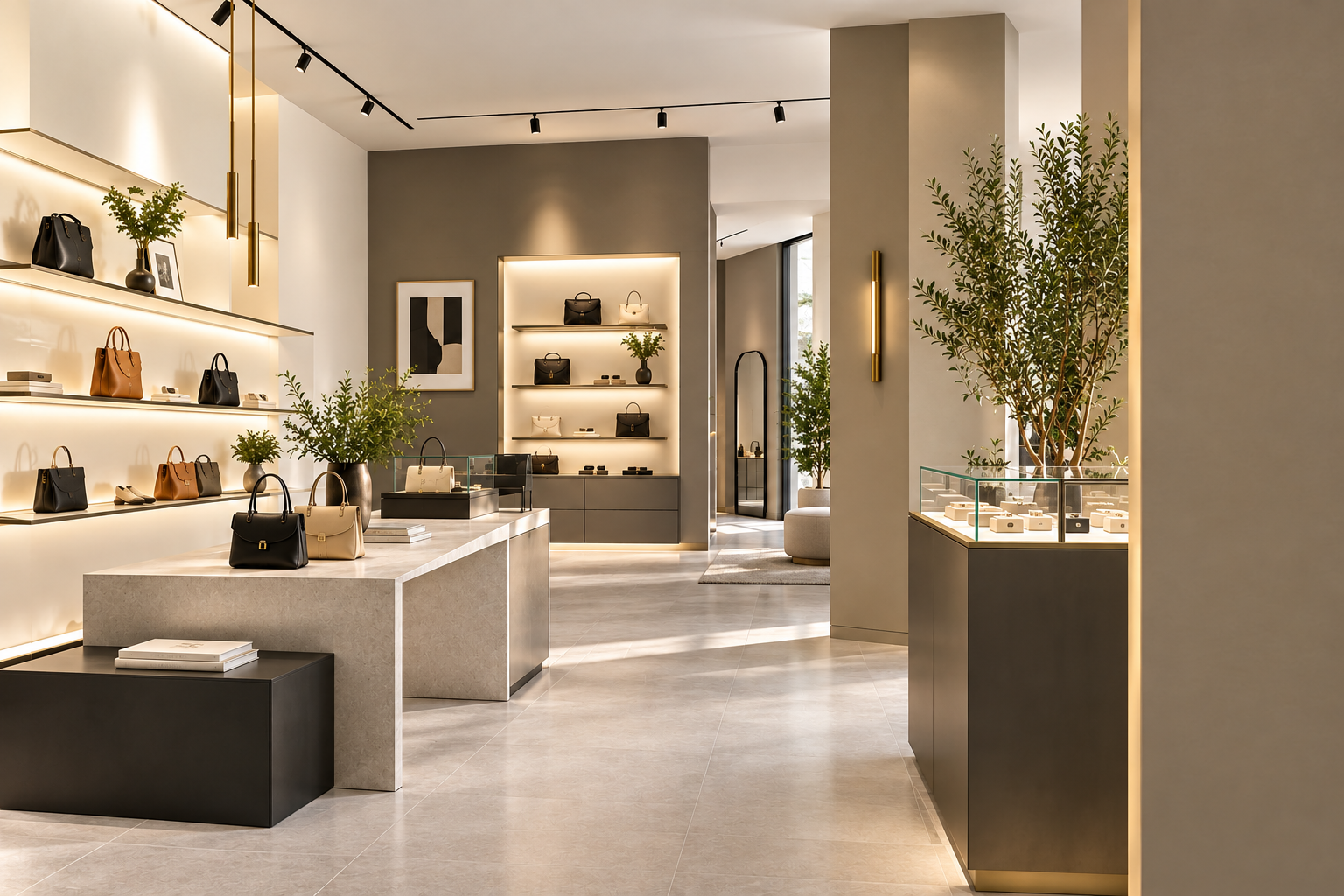
Gallery-style whites, warm greys, and greige keep product colors accurate. A matt finish limits glare on large walls.
A charcoal or brass accent adds a premium touch without competing with the display.
Schools and Educational Spaces
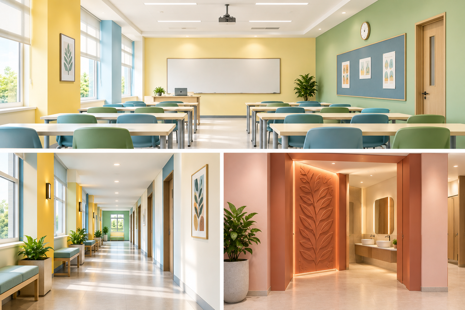
Soft yellow-whites, pale blue, and sage green keep classrooms bright and calm. Add one bright accent per corridor or zone for energy.
Color can carry character here too. In a college washroom project, Idyllic Interiors used a blush and terracotta entrance with a leaf-motif wall panel to turn a service space into a design feature.
Paint Colors That Work Well in Dubai's Light and Climate
Choosing an interior paint color in Dubai means planning for strong sunlight. The same shade can look soft at 9 a.m., washed out at noon, and golden at sunset.
How Sunlight Changes Paint Colors
- Strong light washes out pale, cool shades, so they can look flat or stark
- Warm shades keep their richness and look softer in bright rooms
- Rooms facing the afternoon sun carry a warm cast that deepens reds and oranges
- Shaded or internal rooms look darker and cooler, so they suit warmer tones
Colors That Handle Glare and Glass Facades
|
Lighting condition |
What happens |
Colors that work |
|---|---|---|
|
Glass facade, strong glare |
Pale cool shades look flat or icy |
Warm white, greige, sand, soft sage |
|
West-facing room, afternoon sun |
Warm cast makes strong colors feel heavy |
Soft blue, light grey with a warm undertone, pale green |
|
Shaded or internal rooms |
Colors look darker and cooler |
Warm white, cream, light stone |
|
Evening and LED lighting |
Cool LEDs flatten warm shades, warm LEDs deepen them |
Test samples under the final fixtures |
Our On-Site Color Test
This is the playbook Idyllic Interiors follows before any wall is painted:
- Paint large sample patches on the actual wall, not on a chip or a card
- View them in the morning, at noon, and in the evening with the lights on
- Check each shade against the floor, furniture, ceiling, and joinery
- Ask for the light reflectance value (LRV) of each shortlisted color, which tells you how much light it bounces back
Paint Color Mistakes to Avoid
|
Mistake |
Why it hurts |
One-line fix |
|---|---|---|
|
Skipping on-site samples |
A chip never matches a full wall |
Test large patches on the real wall |
|
Ignoring lighting |
The shade shifts between day and night |
Check samples in morning, noon, and evening under final fixtures |
|
Following trends that date fast |
The space looks old within two years |
Keep the base neutral and put trend colors in accents |
|
Choosing glossy finishes for large walls |
Glare shows every wall flaw |
Use matt or eggshell on large walls |
|
Painting every room the same color |
Spaces lose their purpose |
Match color to what each room does |
|
Forgetting brand colors |
The interior feels disconnected from the business |
Use brand colors as the 10% accent |
Conclusion
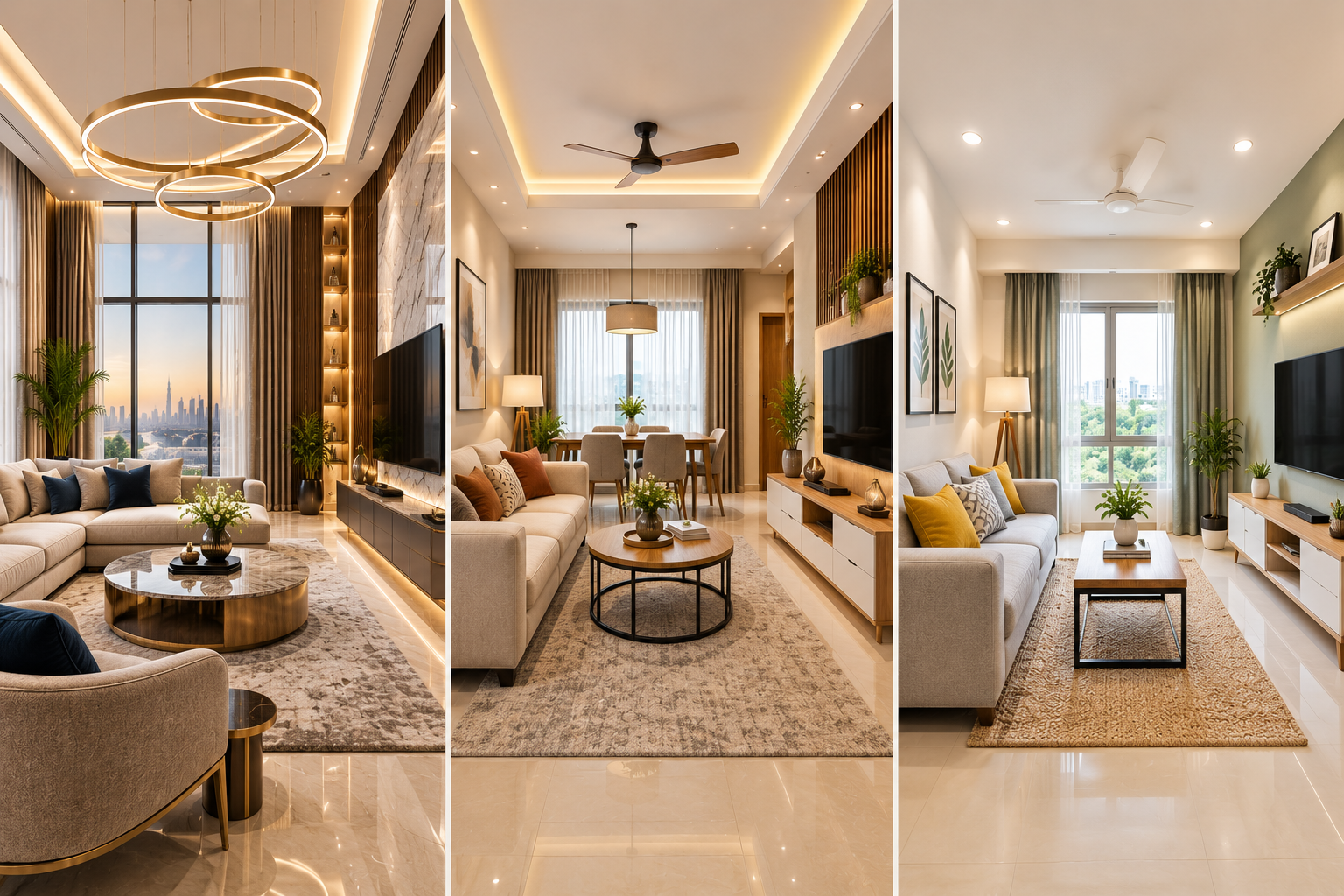
The most beautiful interior paint colors are the ones that suit the room, the light, and the people using it. Start with a warm neutral base, add one or two accents, and test every shade on site before you commit.
This is where Idyllic Interiors works differently. Most paint guides come from painting contractors or furniture suppliers, who handle one part of the space. Since 2010, we have delivered design, craftsmanship, and project management under one team.
That means the palette, the lighting, the joinery, and the finish are planned together. The color you approve on the sample board is the color on the finished wall.
Planning an office, showroom, retail store, or school interior in Dubai? Talk to Idyllic Interiors about a color and fit-out consultation.
FAQs
What are the most beautiful interior paint colors for offices?
Warm white, light grey, greige, soft blue, and sage green are the most popular choices. They look clean, suit most furniture, and stay comfortable over long working days. Add terracotta or deep navy as an accent.
What color makes a small office look bigger?
Light, warm shades such as warm white, soft grey, or pale sage reflect more light. Paint the ceiling one shade lighter than the walls and use a matt or eggshell finish to limit glare.
Which paint finish is best for commercial walls?
Matt suits meeting rooms and showrooms. Eggshell suits most open-plan offices and classrooms. Satin suits corridors and busy areas that need frequent cleaning.
How often should an office be repainted?
Most commercial interiors need a repaint every 3 to 5 years. Corridors, reception areas, and school spaces may need it sooner, depending on traffic and the finish used.
What paint colors suit Dubai's climate?
Warm whites, greige, sand, soft sage, and soft blue handle strong sunlight and glass glare well. Test them in your own space, since orientation and lighting change the result.
Should I choose warm or cool colors?
Warm shades feel welcoming and handle strong light, so they suit reception areas, retail stores, and cafés. Cool shades feel calm and focused, so they suit meeting rooms and desk areas. Many spaces mix a warm base with a cool accent.